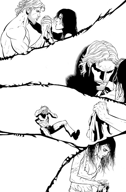
Here's something interesting that I helped out on. It was only over two pages of Scott Clark's digital pencil work for Grifter #6. Here the comps that DC sent me. It's the last book I've done for DC which has that older DC swish logo on the top left.
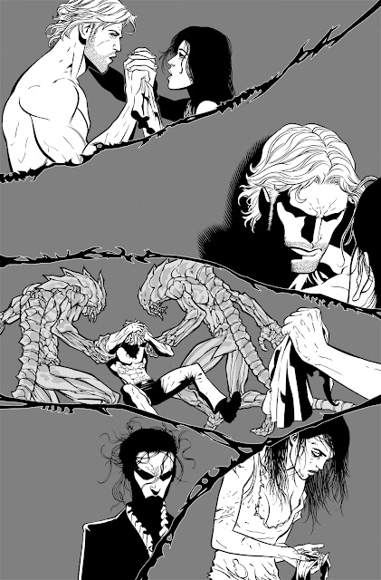
For the two pages I worked on, Scott Clark drew them digitally, so there's no pencil on bristol boards, Completely digital. All I had to do was print out the digital drawings on blue-line and ink over that traditionally. Here's how one of the pages turned out. I'll explain the grey backgrounds a little later. There's a lot of back and forth tasks going on here, so it if gets a bit confusing, don't worry about it. Sometimes my brain works funny that way.
 |
| What I sent back to Scott Clark, so he can add his own backgrounds digitally. |
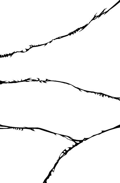
It was my first time working with Scott and he requested the files to be sent back to him in Photoshop layers. So with the traditional way of working, comes some digital work as well. First, I inked only the panels and scanned that up. I'll explain this as well a little bit later.
 |
| Panels |
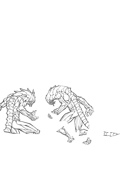
Then I moved on to inking the Daemonites in panel 3, as shown below in a separate layer.
 |
| Daemonites |
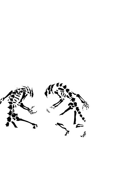
The Daemonites' body where see-thru, so you can see their bones. So I went in there and created another layer in photoshop and inked that digitally inside the body. Creating a grey fill with the original Daemonite layer and making it opaque, so I can see through their bodies to the bones below.
 |
| Daemonite bones |
Then I went back to the bristol boards and inked the rest of the figures by hand. Then scanned that up.
 |
| Figures |
Once all that is done, I inked the character Carver in panel 4 in a separate layer in Photoshop. Her hair had to be done a certain way as requested by Scott, so I did that in Photoshop.
 |
| Carver |
After all that traditional hand inking and digital inking, I put them all together and created the first image above with the grey background. The grey, I added in with a separate layer to I can see what's going on with all the other layers above. Otherwise it's a mess for me visually. Finally, remember the panel lines I first inked above? I created a white stroke in Photoshop around the line work and added that on top of the page. It helps separate the panels which also gave Scott a choice of using it, or getting rid of it all together after his added backgrounds.
