Wednesday, December 12, 2012

ULTIMATE COMICS X-MEN #12

Ultimate Comics X-Men #12 with my inks over Carlo Barberi's pencils.
Cover by Kaare Andrews, who was standing behind me in a portfolio review line with me years ago over at San Diego Comic Con.  When we were in line, we got to talking and exchanged contact info.  Took one of his sample packets and give to my editor over at Marvel, which lead to his first Marvel mini series work, Before the Fantastic Four: Ben Grimm and Logan.  Which was my first and only time I've inked over Kaare's pencils.

Carlo Barberi enjoys drawing a lot of details into his background.  Panel 1 above is a great example of what he can do.  His lines are so tight and thin, that sometimes I'll my magnifying lamp to get a closer look.  I don't wear glasses and have perfect vision.  But with the amount of details, it's always better to make sure and 'zoom' into the line work.

Again with the nice fine details.  You see the car rear on panel 1?  All if that, I've inked with templates.   I can always freehand those line work, but with mechanical stuff, I like to make them look... well... mechanical.  Like it's machine made.  
With this page, there's hardly any template work here.  Majority of it is with a brush or pen. in freehand.  Sometimes, I'll still used a ruler to draw squiggly lines.  Like what I did on the cushion walls in panel 2 and 3.  Using the ruler as a guide going up and down, but when ink pen touches paper, I wiggle it along the straight edge.  

Double Page Spread.  Again, templates with everything mechanical.  Now, often times, using template is more work than going freehand.  Sometimes I don't have the exact template for the size that's pencilled.  Take for example the larger wheel on the wheel chair.  Keep in mind that this is a double page spread and the original art being 17x22.  You can imagine how large that wheel is drawn.  So what I'll do is use a template to ink in a certain line, then use another template to continue into a different direction, and so on and so forth until I get that whole wheel done.  Lots of switching around for one oval. 
More info about this comic here.

DC UNIVERSE PRESENTS #6

Here's DC Universe Presents #6, Challengers of the Unknown.  Is it, "DC Universe Presents #6 Challengers of the Unknown" or if it's "DC Universe Presents: Challengers of the Unknown #6"?  I dunno...   
This was a fun project while it lasted.  Why?  Because I got to work with Jerry Ordway, inking over his pencils.  Before I even started working in comics, I was a huge fan of his work.  Taking it a little further, I was a fan of his artwork before I even knew the name behind it.  And now, I've gotten to work with him.  Even if it's just for a few pages, it still awesome!

All template work with the Plane.  Shoot, everything mechanical is all done with templates.  Everything organic, by hand.  Brushes, nibs and pens. 

Look at these faces!  Man... I got to ink over Jerry Ordway.  Hot Damn!

Tapering lines.  Panel 3 where he's video recording with the lights and all, that was a nice challenge mainly because  those tapered lines and light source was coming in from all over the place.  I wanted to give these tapered lines a sharp tip both on the white and in the blacks.

Jerry's a great penciller, all I needed to do was follow the lines that he drew.  I didn't for the larger splash panel with all the mountains textures.  At first, I was inking them in meticulously as how Jerry pencilled them. Then for some reason, I started to automatically do textures for the mountain.  Scribbling and noodling in the blacks, then pulling out the white-out to scribble and noodle in the whites above the blacks.  Years of inking makes you do funny things sometimes.   Man... I got to ink Jerry Ordway!  
More info about this book here.

UNCANNY X-MEN #3

Uncanny X-Men #3.  I did some inks over Rodney Buscemi's pencils.

Texture fun with the chair in panel 2.

My favorite panel is the last one.  Where she's walking out of the column.
Marvel's website about the book is here.

GEMINI #5

Gemini #5 for Image comics. 
Helped out on a couple of pages over Jon Sommariva's pencils.
Bald guy

Guy with lots of hair
More about this book here.

VOLTRON FORCE, VOLUME 2: TOURNAMANT OF LIONS

This is Voltron Force, Vol. 2: Tournament of Lions where I've inked a few pages over Dario Brizuela's pencils.  

An interior page.

Double page spread.  The penciller used photoshop and duplicated the spaceships.  Since I was inking this on blueline printouts and everything was already there on the bristol board, I decided to ink them all by hand... using templates for each one of them.

Here's are the five characters for each of the lions. 
More about this volume from VIZ Media is located here.


Tuesday, December 11, 2012

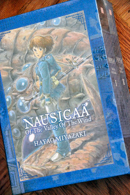
NAUSICAA OF THE VALLEY OF THE WIND BOX SET

Since youth, I've been a Hayao Miyazaki fan.  Of course at the time, I didn't know who he was.  Just the movies he brought to us.  As I watch more of his films, I started to recognize his name and the quality of his animated films.  Some of my favorites are My Neighbor Totoro, Spirited Away, Castle in the Sky, Princess Mononoke, Porco Rosso, Howl's Moving Castle, Ponyo, and of course, there's Nausicaä of the Valley of the Wind.  

Then I discovered the comic book, Nausicaä of the Valley of the Wind, that VIZ published between 1988-1995.  They were those smaller 48 page black and white comics published in America, translated from Japanese and lettered by Tom Orzechowski and Wayne Truman.  I bought them all up as I found them.  

In 1995, VIZ decided to publish all the same stories in a 'perfect collection'.  Four thicker volumes that were around 260 pages each.  Graphic Novels, as they're call today.  However, they were smaller in size.  Sort of a pocket book.  You get more story and pages to read, but the art was shrunken down a bit.

Then in 2005, VIZ decided to publish Nausicaä of the Valley of the Wind again .  Only this time, to have it in a much larger size format.  Larger area size than the original comics.  Large than the typical regular sized comics of today.  Mainly so people can see more of the artwork.  Seven volumes ranging from 130 to 230 pages each.  And they decided to have the whole story re-lettered and the art touched up.  This is where I come in.  VIZ contacted me and offered me the project.  Re-lettering the whole story and touching up the artwork over original Japanese stats from Studio Ghibli.  I jumped at the opportunity.  It was months of hard work especially since the lettering and art touch-up had to go back to Studio Ghibi in Japan for approval.  But every minute was worth it.  I got to re-read the story again, I got to look at all the artwork very closely, panel to panel with a fine tooth comb, I got to touch-up and re-draw some of Hayao Miyazak's work, getting to his style as close as I can.  In the end, VIZ told me Studio Ghibi was impressed with my work.  Here's a link to all seven volumes I've worked on.  

Fast forward six years later to 2012.  VIZ decides to publish Nausicaä of the Valley of the Wind as a two volume hardcover slip case Box Set.  They contacted me again to offer me the art touch up and spot lettering.  I accepted in a heartbeat.  Didn't even need to think about it.  Once I heard the name "Nausicaa", the words "Yes" couldn't come out faster from my mouth.  


Here are pictures of the published book.  It's huge and heavy!  Larger than the thickest telephone book out there.  Two volumes in one slip case with a poster of Nausicaa.  You can get more info about Nausicaä of the Valley of the Wind Box Set here.

SENSATIONAL SPIDER-MAN #33.2

Sensational Spider-Man #33.2.  That's 33 point 2!  Inked this over Carlo Barberi's pencils.

Vulture flying off with Carlie Cooper.

Web-head's web weaving.

Spider-Sense tingling!

Butting heads.
More info here.

SENSATIONAL SPIDER-MAN #33.1

Sensational Spider-Man #33.1.  Yeap, that's number33 point 1.  It's to squeeze in right after #33 and before #34, if there is a #34.  I did the inks over Carlo Barberi's pencils.

Web-Head and the Vulture.

Every time I get to work on Spider-Man and he's spinning that webbing, I always verbally mumble to myself *THWIP*   *THWIP!*   *THWIP-THWIP-THWIP!!!*

Spidey on the wall.

Splash page.
Some info here.

X-TREME X-MEN #2

X-Treme X-Men #2. 

Only helped out on 1 page over Stephen Segovia's pencils.  My first time working  over his pencils.  
Here you go.

JUSTICE LEAGUE OF AMERICA: OMEGA softcover

I got a hardcover comp copy of this book earlier from DC Comics.  Now this one's the soft cover version of  Justice League of America: Omega 
More info here.

STORMWATCH #10

No comps for me this time.  DC Comics didn't send me any.  Anyways, here's how the cover to Stormwatch #10. 

My inks over Ignacio Calero's pencils. Panel 1 was fun.
More info here.

STORMWATCH #11

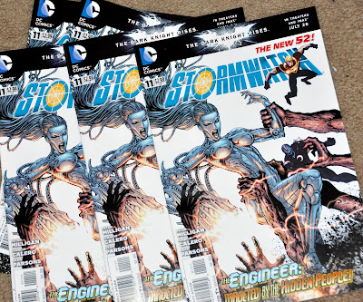
Stormwatch #11 comps.  DC Comics sent me 5 copies for inking 2 pages.  
My inks over Ignacio Calero's pencils. 

Helped out on 2 pages shown here.  Panel 2 above was fun.
And here's the second page I did.
Comic info here.


WOLVERINE AND THE X-MEN #7

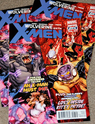
Here's Wolverine and the X-men #7 with my inks over Nick Bradshaw.

Wolverine doing the what he does best.

This Kid Omega character reminds me of Green Lantern.  Creating objects with a thought.

Night Crawlers everywhere. *BAMF*  *BAMF!*

Again, I was reminded of Green Lantern when I was inking inset panel 1.  I did panel 3 with Kitty barfing.  
More info here.

ULTIMATE COMICS X-MEN #8

Here's Ultimate Comics X-Men #8 with my inks over Carlo Barberi's pencils.

Double page spread!  This one took a couple of days to complete and I made sure I put in all the details.  Fun times.

Swoosh!

All this smaller characters, I used a magnifying lamp to get a closer look.  Had to get in there to get all the finer details and  faces.  Faces are important.
This book's here.

BATMAN: BRUCE WAYNE – THE ROAD HOME softcover

Comp for Batman: Bruce Wayne-The Road Home.  Softcover.
This one's a softcover trade paperback.  The other one I posted here is the hardcover version.  The trade paperback information is listed here.