My inks over Carlo Barberi's pencils for
Deadpool #35. Here's a splash page.
Same page all colored and lettered...
Double page spread below. I was talking to Carlo Barberi on the phone and told him I was inking the capsule. Then he goes and tells me he modeled that based on a light saber. I nearly fell on the floor laughing because I didn't see it before. Then we had a conversation about different light sabers.
Below is a page that I'm happy with how it turned out. I stared at this page for quite some before I started inking it. Where to apply halos so nothing gets lost. What to halo and what not to halo. How big and small the starts should be so it doesn't confuse with the rocks floating around. How am I going to ink the white speed lines.... use white ink or ink around it. Tapering out of speed lines from straight lines. A lot of planning before the inking.
Finally, Deadpool in bed...
In stores now. Come to papa!
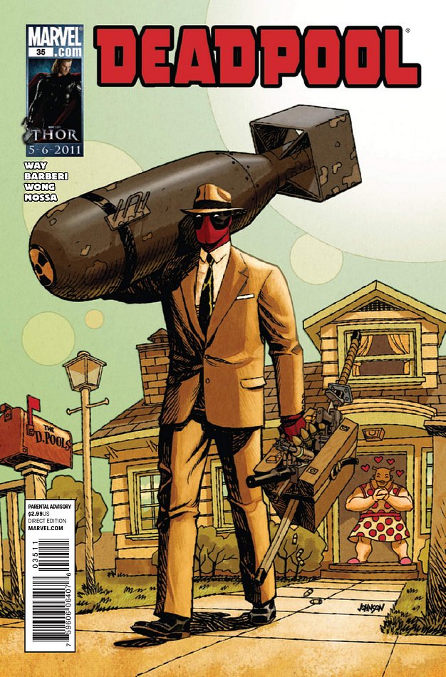


I picked this up in the store, nice stuff as usual.
ReplyDeleteAnd I can see how the page with the space and halos had to take a lot of planning. Where it really shows is the last panel. How even in a black space environment, you're still able to give depth and draw attention to the main figure by using the halo effect to make it pop.
You got skillz!
Thanks, Patrick!
ReplyDelete